case study

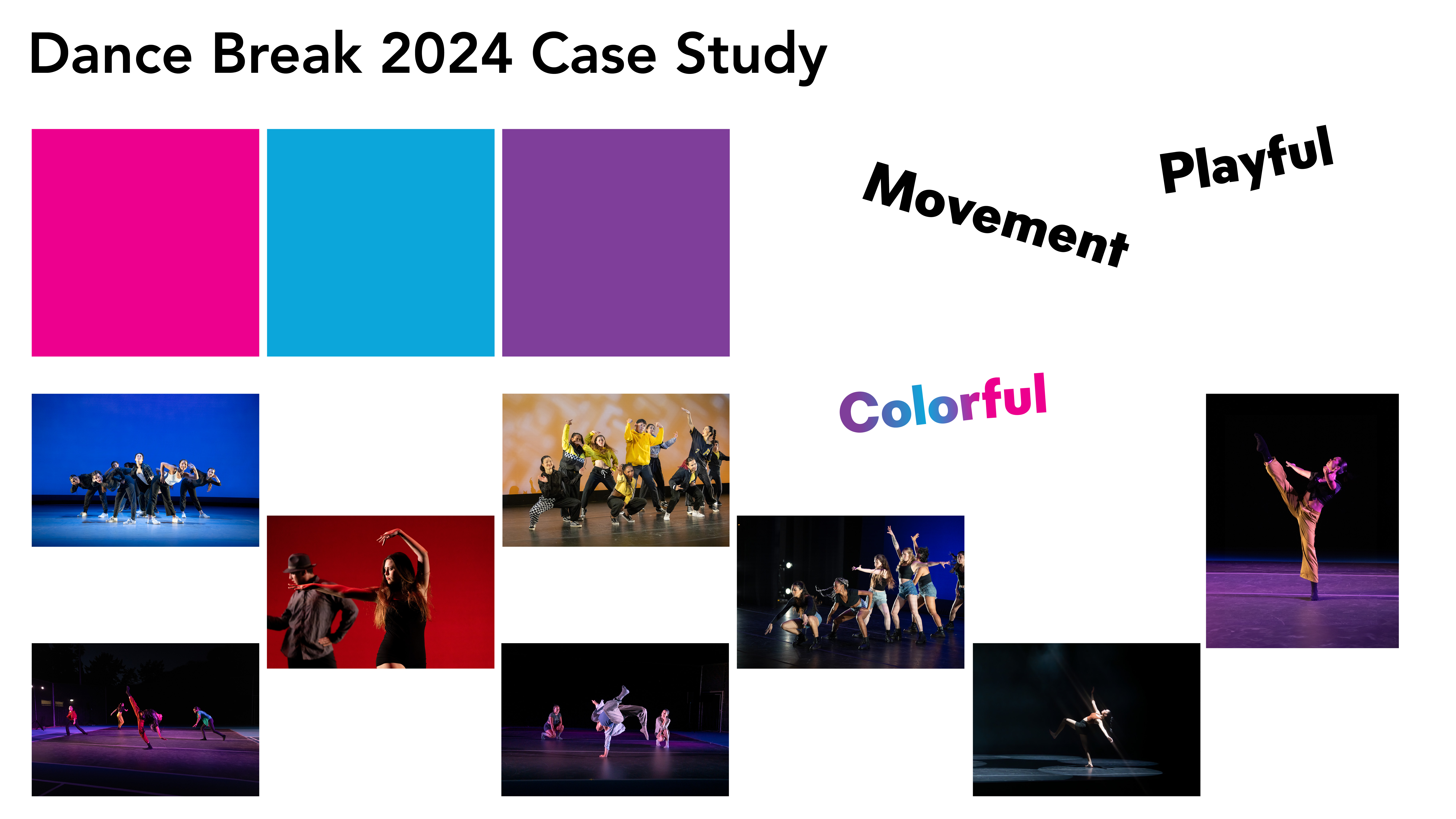
Dance Break 2024, MiraCosta’s annual dance showcase put on by the dance department. I was tasked with creating pieces to advertise this performance to increase visibility and ultimately attendance. We were given specific colors to be used, and provided with images. And given words to help set the tone for the project, playful, movement and colorful.

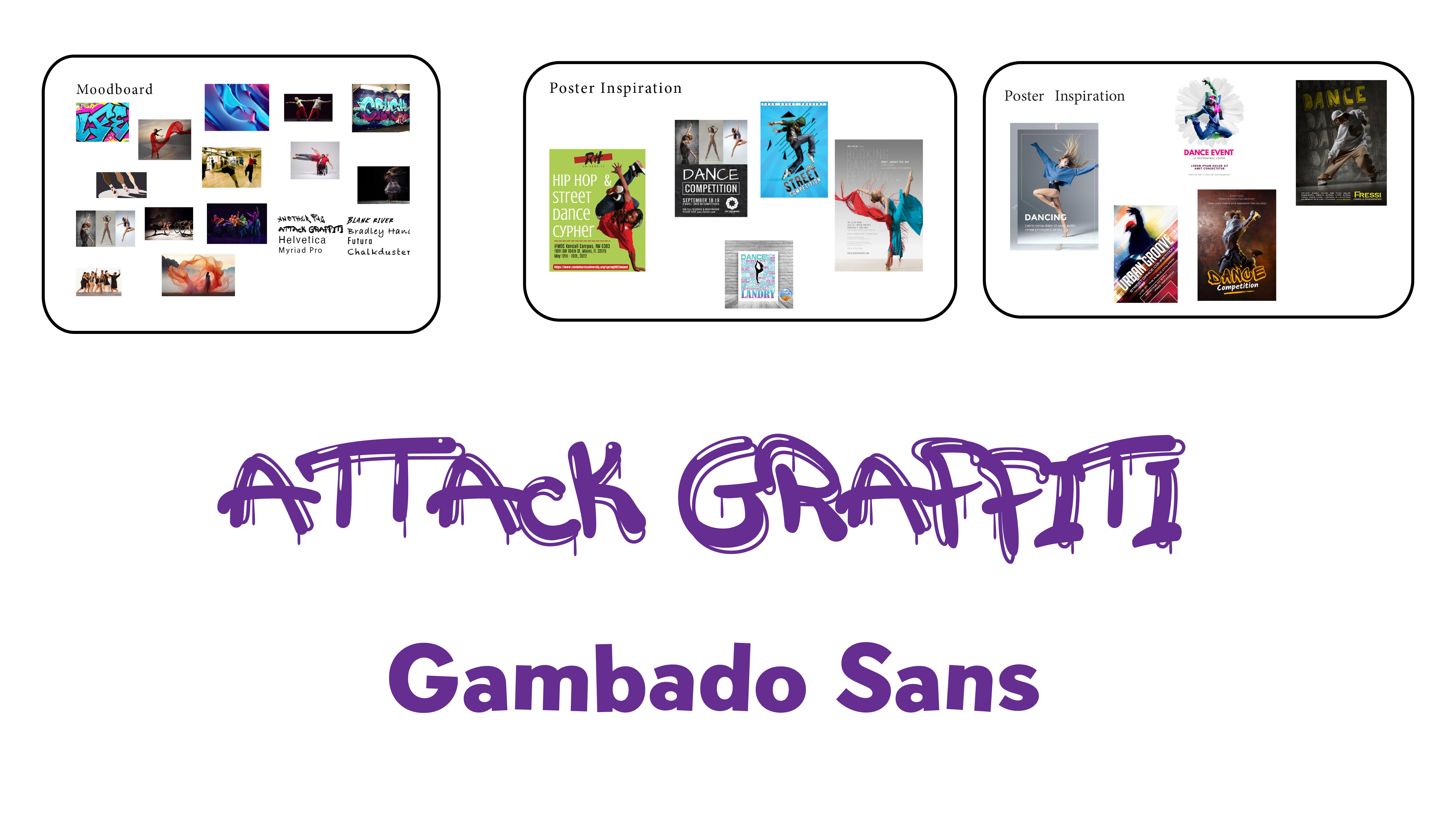
The next step in my design process is a lot of research. After doing this I create mood boards to help guide my decisions for the project. Here I created a mood board and poster inspiration boards. Before moving on to my next step I also like to research fonts. I chose Attack Graffiti for its sense of movement and playfulness. I had initially decided to go with Helvitica but as I went along I realized it wasn’t working and went back to researching fonts. I landed on Gambado Sans. It was legible but added an even more playful sense of movement.

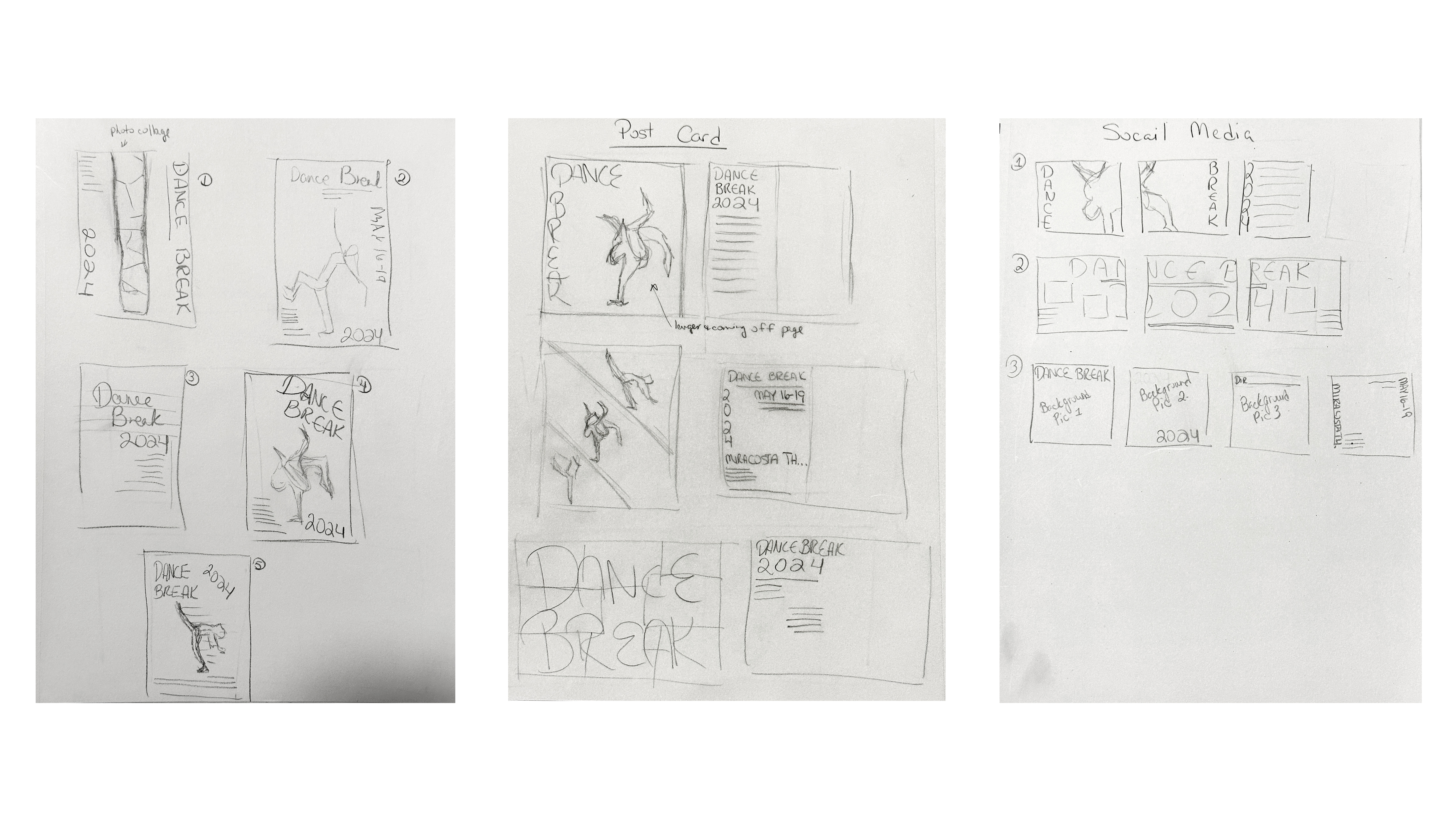
This next stage in the process is one of my favorite parts, and that is the pencil on paper sketching phase when I am able to use all of my research and put it on paper to see what I can come up with. For this project I combined the clients wishes with my research an came up with several different designs for the poster, postcard mailer and instagram posts.

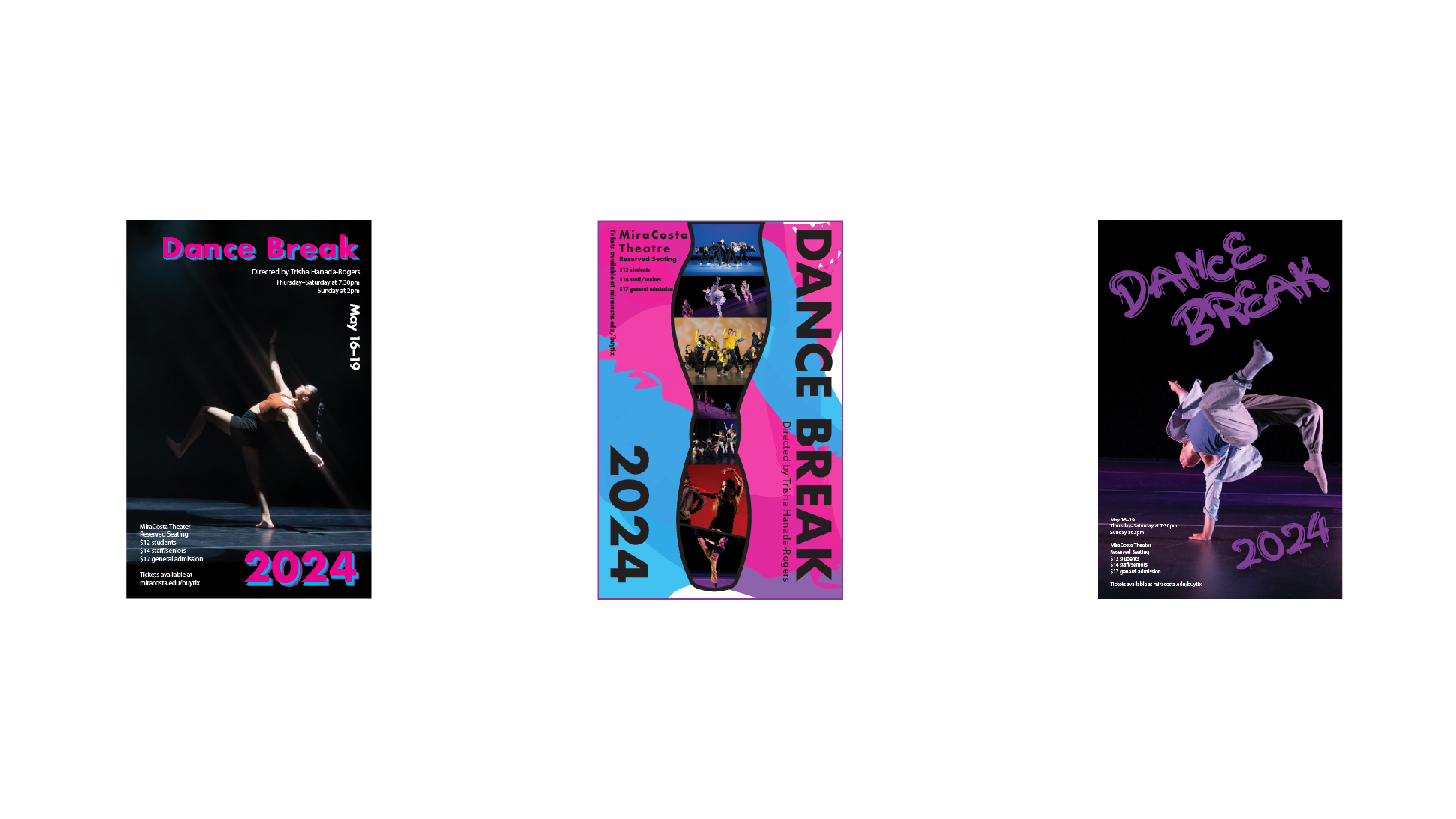
After choosing which sketches I believe would look best I move into a stage that I like to call the digital sketching stage. I started with the poster design as I knew my other designs would be based off of this design.

In this slide you can see which digital design made the cut. My final design has the movement, playfulness and color requested. Here we see the poster, postcards front and back, and the social media posts and all of them mockup to give you a feel about how they are going to look when printed up and used.